
For over 20 years, SURGIRIS has been supporting hospitals, private clinics, and healthcare facilities in equipping their operating rooms, intensive care units, emergency rooms, and resuscitation rooms.
Smart Vision: A new identity to help you find your way
The year 2021 is a sign of renewal for SURGIRIS, as it celebrates its 20th anniversary , Maison Surgiris presented its partners and customers around the world with a new identity, confirmed by a change in the company's logo and graphic charter.
With over 20 years of experience in the medical device market, SURGIRIS has successfully revamped its image to match the innovative and high-performance products designed and manufactured at our headquarters in Croix , near Lille.
This new image is built around one main focus: Our primary expertise: Light & smart technology, and we will openthe doors to our thinking during this change of identity.
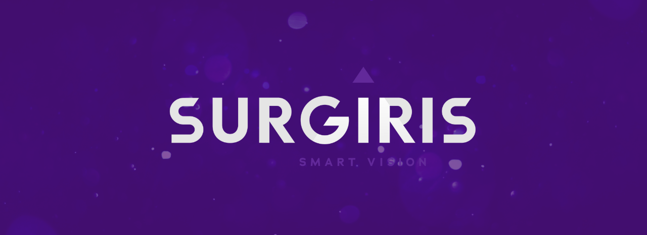
SURGIRIS brand definition
The main concept behind SURGIRIS's new identity revolves around a single principle: "light." At the heart of Maison Surgiris, light is dynamic, responsive, and intelligent, and these important qualities must be reflected in our new identity.
The baseline " SMART VISION " is the key element of our identity renewal:
- The word SMART refers to the ingenious, intelligent, efficient, and elegant nature of light and our various activities.
- The word VISION is used to describe the mindset of the SURGIRIS team, which is focused on research and development, innovative technologies, responding to developments in the medical sector, and the constant search for new concepts that are always evolving with the times.
Logo definition
The design process for the new logo was a collaborative effort involving various working groups. The initial version of the logo did not meet management's expectations or reflect SURGIRIS's new identity. An important decision was made regarding the typography, with the letters of the logo being capitalized to better represent the grandeur of SURGIRIS. In addition, the choice of a circular format with cut-out elements echoes the aesthetics of SURGIRIS's flagship product, SURGILED.
In line with this strategy of strengthening identity, we chose chosen the triangle to replace the dot on the "i." This triangle is used as a symbol of a light prism, to reflect SURGIRIS's field of activity : manufacturer of lighting solutions. Indeed, the prism of light is an optical instrument used to refract or disperse light. Placing the prism in this position is intended to illuminate the new logo.
SURGIRIS a bold color choice
The medical sector is very often associated with the color blue, which was featured in our old logo. In order to mark a change from our former identity, it was essential to change our graphic charter. The aim was to emphasize the visionary side of SURGIRIS and stand out from our competitors, we opted for purple, a symbol of creativity and expertise, but also the color of royalty —a perfect blend of the two primary colors, blue and red.
This change of identity allows SURGIRIS to assert itself and think big, with the primary aim of retaining its DNA while entering a new era. Its core belief is to design high-performance operating room equipment for the most demanding applications.
If you would like more information about our company, please visit the SURGIRIS pages or contact us directly using the contact form.